
One of the key challenges in an inception is to learn about the business processes and its workflow in a fair amount of detail in a relatively quick amount of time. The idea is, not to just learn about the client’s business processes, but also to ensure that various stakeholders within the client actually share that understanding instead of having varying ideas in their own heads.
There are plenty of methods to study business processes but they are time consuming and heavy weight and may be not as collaborative. A classical way is to create process map diagram & value stream mapping. Such methods are valuable in different settings. In our context, an inception, we try to uncover information in enough detail to be able to kickstart delivery without spending loads of time and making it a formal inception phase.
During a recent inception, we (Sunit Parekh, Birinder Singh, Sarbashrestha Panda &Amit Dhakad) combined ideas from different process analysis methods and came up with this hybrid light weight approach. It is not full blown value stream mapping but this approach does have elements of it and highlights the processes that are most time consuming and potentially wasteful.
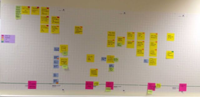
The process map was built on a large canvas/wall, so that it would constantly be visible to all the participant in the inception. We started building the process map by plotting a timeline on x axis and noting different steps in the process flow on the y axis. Also, the actors/roles involved in the process were indicated for each process. A legends for denoting the actors was also put up on the wall for the ease of identification. Building this full as-is process map of the as-is process was done over multiple sessions spanning a couple of days.
Stage 1: After couple of session with business first cut of the as-is process timeline map looked something like this
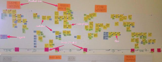
Stage 2: After another iteration, the as-is process shaped up to something like this. It was also clearer in the client stakeholders’ minds. It also had functional area clearly called out.
Advantage of having large visible canvas for the current as-is model is that it provided us a reference point at all times in inception. It became one of the living document for the team.
Stage 3: We then took this forward and mapped the future to-be process on top of it by putting magic chart in-between.
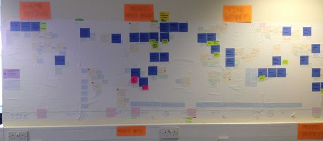
Being able to superimpose the potential ’to-be’ process on top of the ‘as-is’ process allowed everyone to be able to ‘see’ how it was lighter weight in comparison. It also allowed us to ensure and double check that we were indeed covering the key activities / steps from the current process and losing / getting rid of only the non value adding ones.
At the end, we digitalized above process map. This structure / format / way of creating a process map was very well received by the business teams as well. They, in fact, suggested that the maps should be left as is in the room for anyone new to the business to use as a starting point for understanding their business processed. That feedback was indeed awesome. :) To me, this is called innovation and collaborative effort was what made it possible.
Stationary used for building such map:
- Magic Charts with Grid
- Mulitcolor Stickies (pink was used for timeline event/instances, yellow for activities in business process)
- Arrow Stickies (cut sticky in arrow shape or get 3M arrow tags)
- Small Dot Stickers (used for legends such as actors for activities)
- Sharpies
Post written collaboratively with Birinder Singh
Last modified on 2012-05-07