Lots of time when I discuss Responsive Web Design (RWD), sometime I find out that we don’t know the problem, we are trying to solve with RWD. And the objective of this blog post is look into the history and learn what problem we try to solve with RWD.
The multiple screen resolution problem is not new, even in old days the monitors had different screen resolution. The problem exist from old days. In first attempt we solved multiple screen resolution problem with Fixed Width web page design (Fixed Width Layout Approach). 960px based fixed width design were very common for websites. One of the most popular CSS framework with fixed width was blueprint. The problem with fixed-width layout is white (empty) space on side of the screens. Designer also used that space by having creative backgrounds for the page.
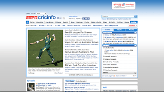
The multiple screen resolution problem didn’t go away, after smartphones and tablets the problem became more prominent. In second attempt to solve the problem, used multiple templates for different devices on server side (Seperate Mobile Website Approach). The downside of using the server side device specific templating is that, HTTP caching can’t be done. Which is non-negociable for scalability, and to overcome caching issues, on first request the application server recognises the browser agent and redirects the site to device specific page like www.cricinfo.com or m.cricinfo.com By using different sites/urls for different devices HTTP caching problem was solved.

Try visiting page: guardian.com and cricinfo.com on mobile device and notice the redirect.
Now the problem started with maintaining multiple sites/applications. Use experience was not consistent across devices. It was very difficult to keep the feature parity across the device specific sites. Application development, maintenance & production cost & effort increased significantly.
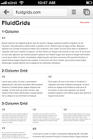
During same time period people realised that we are wasting so much screen real estate by doing the fixed grid layout, and the fluid grid layout design started becoming popular for desktops.
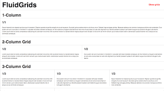
However, fluid grid system depends heavily on browser support and performance. Making it old browser compatible was a big task.
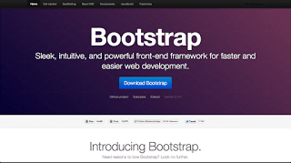
The latest attempt of providing best viewing experience on all devices & screen resolution at client side (browsers) is known as Responsive Web Design. With frameworks like Twitter Bootstrap, it has become easy to get started learning and using Responsive Web Design concept.

Notice menu, text, links and buttons in above two screenshots. Same site visited in desktop browser and mobile browser.
To achieve HTTP caching it was very important that all this dynamic behaviour to be kept on client side, so server has to render the same page for all devices irrespective of the screen sizes and resolutions. With this approach HTTP caching CDN/Reverse proxy can be leveraged agin to achieve high scalability.
Be aware when using Responsive Web Design, Works best with latest browsers and high end smartphones, Since RWD relies heavily on client side optimisation and adoption, client needs be powerful. Slow internet connection speed will give bad user experience since it might take very long to load page. Since all content irrespective of the device is transferred to client. Sometime multiple variations are kept like Menu and the overall web page size increases. Specially for mobile the page size might be very large. Checkout the size of twitter bootstrap.
Last modified on 2013-02-12